
Anchor Point is a speculative beer brand targeted at the specific market of sailors, navy men, fishermen, surfers, or any such adventurous soul living near or on the sea. There are plenty of beer brands that target all sorts of blue-collar workers, everything from farmers to construction workers and the 9-to-5 salary men who need to chill after a long day's work. Yet I found that there was potentially an untapped market in creating a beer that spoke to those who live by the sea.
Anchor Point was designed with the adventure and excitement that come with travelling the ocean. From the Kracken's arms and the steering wheel in the logo to the illustrations made to resemble the artwork that adorns old parchment maps, all made to conjure in the mind of consumers the idea of the adventurous nature of life at sea.
Skills: Adobe Photoshop / Adobe Dimension / Adobe Illustrator


Work Process
Here we have a quick glimpse into the design work as I tried to not only find a balance between the differing weights of the text involved in making the logo for the beer, but also explorations into what framing device would create the desired aesthetic while not taking all the attention away from the text within.
Eventually, the more rectangular design with the two arms of the kraken on each side and the wheel at the bottom was chosen as it had enough breathing space in its design to let the font and text within its frame take center stage.


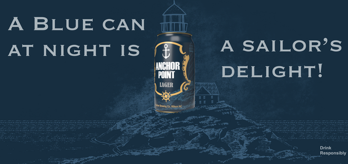
As for the designs in the background, the lighthouse scene was the first background completed and was designed with woodblock and copper plate printing in mind to give the beer a more old-fashioned and adventurous feel. The goal was to conjure in people's imagination the feelings ye old sailors or pirates might get when they look at their old maps of the world, back when people would sail around to find their next adventure.
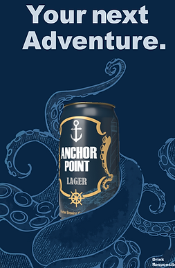
To flesh out the design feel, additional illustrations of the same style were made for the advertising campaigns, each harkening to different aspects of adventures at sea.
An early version that got scrapped later on. There were plans originally to incorporate the etch-work design of the can in the advertising, but that plan was rejected and was replaced with a plan to use the new batch of images seen above in order to flesh out the world and atmosphere created by the can.
For product design, I often find that seeing is believing. It's that final piece of the puzzle that really reveals the full potential of a product. After all, it's much easier to envision buying a product if you can actually visualize how it will look in space.
I set up a scene in Adobe Dimension that would allow the products to really shine, and worked to lay it out in a way that would make it feel real while also not distracting with an overly busy background.
(Below: an early shot building the scene before the logo was finalized, the set up for the final shot, and the final shot itself.)

