Refreshment Revival is a speculative beachside music festival used as a promotional vehicle for soda and soft drink vendors. The idea was to create a vivid and lively party environment that would allow guests to subconsciously build personal bonds with the brands as they partake in games, events, and music. The goal was to find the perfect balance between a promotional vehicle and a summer beach party that young adults would genuinely be excited to go to and talk about on social media.
As such, I knew the colors and design had to be as fun and bubbly as the festival they were going to represent. Something with bright, splashy, and cheerful colors that would draw in the young adult crowd, that they could then take home as merch and wear with pride.
Skills: Adobe Photoshop / Adobe Dimension / Adobe Illustrator / Adobe Indesign


Work Process
The focus when designing Refreshment revival was to explore how to communicate soda, sea, and summer fun by pulling together the elements that they shared together. As such, many of the potential solutions focused on rounded forms of bubbles and splashing water.
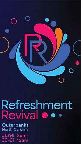
The colors were inspired by the beach at sunset, adjusted to become something brighter and more vibrant that would better capture the energy of summer fun and bubbly soft drinks

The Idea of using a simple, rounded splash as a key element to the design was a key design element even in the earliest drafts of what would become a logo; however, I didn't want to settle on the idea without first examining other ideas.
I explored other options, such as bottle caps and musical instruments, as they were a great way to pull from the "music festival" and "soda" aspects of the Refreshment Revival. However, in the end, the splash won simply because it so neatly tied together the themes of "ocean waves" and "soda" by pulling from the splashy and fun elements of both.
Some designs explored using letterforms made by me personally, to give the design that informal feeling that a summer beach party should embody. In the end, however, the hand-drawn font was abandoned for something more easily reproducible that was still airy and playful enough to capture those summer vibes.


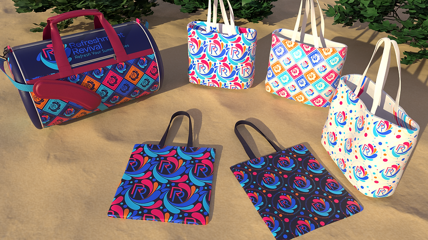
Making the patterns was a fun and interesting part as I got to explore the different ways in which i could use a logo to create something more alive and moving.
(Below: Early designs using one of the alternative logo ideas)

Once the logo was changed/finalized to the swirling splash, we moved on to more flowing patterns. the diagnal grid pattern was kept, but adjusted to match the mood of the updated logo.
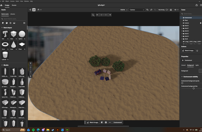
Once the designs were ready, it was time to make the merch, take it to the beach, and show it off! The only real problem is that it's hard to take photos of something that doesn't exist yet, so I created a scene in Adobe Dimensions that would allow me to fully show off the merchandise in a fitting environment before a single item went to production!
(Below: the before "behind the scenes" view and then the final shot)